SharePoint View Formatting: Clean Folder Tiles with Native Links
Overview
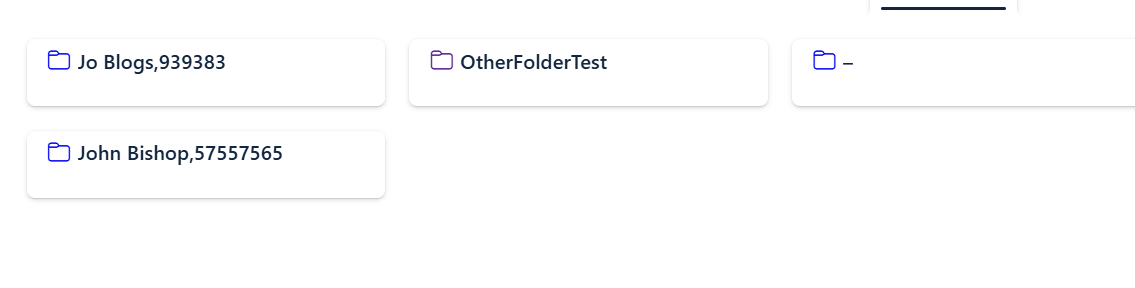
This SharePoint view formatting template turns a list or library into clean folder tiles with a native link. It is designed for a simplified tile experience where the entire card is clickable and the raw URL is hidden.
Why use this layout?
- Entire tile is clickable, not just the text
- Uses a native anchor so the browser shows the target URL on hover
- Removes SharePoint’s default click overlay and selection UI
- Centers the folder icon and title with consistent spacing
- Keeps the tile clean when folder names vary in length
What the formatting does
hideSelection: truedisables SharePoint selection visualsfillHorizontally: truemakes the tile span the available widthhrefmaps to[$URL_Folder]and opens in a new tabtitleshows the URL tooltip on hoverFolderNamerenders with a fallback–when empty
How it behaves
🖱 Click anywhere on the tile
- navigates directly to
URL_Folder - opens in a new browser tab
🧭 Hover
- shows the target URL via the anchor
title - allows browser status bar preview
🚫 Selection
- disabled with
hideSelection: true - no SharePoint overlay click area is shown
🎯 Display
- folder icon displayed using
FabricFolder FolderNameis the visible link text- raw URL field is hidden from the tile content
JSON template
Paste this JSON into your SharePoint view formatter.
{
  "$schema": "https://developer.microsoft.com/json-schemas/sp/v2/tile-formatting.schema.json",
  "height": 60,
  "width": 254,
  "hideSelection": true,
  "fillHorizontally": true,
  "formatter": {
    "elmType": "a",
    "attributes": {
      "href": "[$URL_Folder]",
      "target": "_blank",
      "class": "sp-card-container",
      "title": "[$URL_Folder]"
    },
    "style": {
      "text-decoration": "none",
      "display": "block"
    },
    "children": [
      {
        "elmType": "div",
        "attributes": {
          "class": "ms-bgColor-white sp-css-borderColor-neutralLight sp-card-borderHighlight sp-card-subContainer"
        },
        "style": {
          "cursor": "pointer"
        },
        "children": [
          {
            "elmType": "div",
            "attributes": {
              "class": "sp-card-displayColumnContainer"
            },
            "children": [
              {
                "elmType": "div",
                "style": {
                  "display": "flex",
                  "align-items": "center",
                  "gap": "6px"
                },
                "children": [
                  {
                    "elmType": "span",
                    "attributes": {
                      "iconName": "FabricFolder"
                    },
                    "style": {
                      "font-size": "16px"
                    }
                  },
                  {
                    "elmType": "span",
                    "attributes": {
                      "class": "ms-fontColor-themePrimary sp-card-content sp-card-highlightedContent"
                    },
                    "txtContent": "=if([$FolderName] == '', '–', [$FolderName])"
                  }
                ]
              }
            ]
          }
        ]
      }
    ]
  }
}
Tips
- Make sure your view includes
URL_FolderandFolderNamecolumns. - Adjust
heightandwidthto fit your design. - You can extend the template with additional metadata or custom styling classes.